Monday, 28 February 2011
Sunday, 27 February 2011
Feedback
Sarah, you have made a really good effort with your research and planning work so far - well done. You still have a few things to complete from the list e.g. focus group audio. In addition, I couldn't access your 'audience research' link so please embed this via slide share.
Saturday, 26 February 2011
analysis of Lilly Allen main article
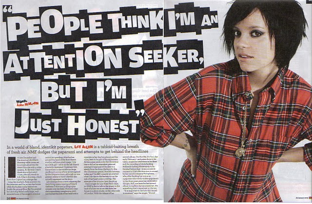
Main image:
- This main article consists of the well-known artist Lilly Allen. Her picture is very big and placed on one whole page which suggests her superiority in the music industry and in the music she produces.
- She is dressed very simple with limited jewellery linking to the floating quote ‘’ I am just honest’ showing she is not an attention seeker.
- Her make up, casual cloths and short hair goes with the type of music she is producing.
- She is looking at the audience (direct address). Editors might have done this to draw audience’s attention as it looks like she is talking to them.
- Floating quotes are used to draw reader’s attention in the most interesting bits in the interview. The floating quotes are typed in a funny way, this is too catch the audiences eye so that they won’t miss the article out.
- Copy is written in columns, which gives it a constant structure, this suggests that the article is aimed at older target audience between the ages of 18-28. This subverts the R&B genre as most main R&B articles are written in a question and answer form, which makes it easy for audiences to read.
- Subheading is used to give the audiences a taste what the main article is going to be about.
- The colours she is wearing connect with the colour scheme that is used trough out the page. Red is a colour that appeals to both male and a female suggesting the magazine is aimed at a heterosexual audience.
- Further more, a lot of black is used trough out the page which links with hear appearance which is quite gothic and goes well with the type of music she is producing.
Friday, 25 February 2011
Coursework production brief
As part of my media coursework I need to create a front page, contents and double page spread of a new music magazine. All images and text used must be original and a minimum of four images must be used. In addition, I have decided to work independently on my music magazine production and come to conclusion to do R&B genre for my music magazine. My target audiences will be between the ages of 15-22 years old. In order to appeal my target audiences I will be including celebrity interviews/gossip, new up coming artists, freebies and many more. Colour schemes I am planning to use are silver/black/gold in order to reflect the richness of my music magazine, I am also going to use bold font types to make my typography stand out and catch the audience’s attention. Further more, I will be using a female solo artist for my front cover wearing clothes that are associated with the R&B genre such as hoody and tight leggings.
Thursday, 24 February 2011
sketch double page spread

For my double page spread I have decided to do question and answer structure as this is more appealing to younger audiences, which my music magazine is aimed at. The interviewer will ask mainly open question to the main artist as this will give the artist the opportunity to express her feelings and inform the audiences more about her. If I use close question the interview will be quite boring and unexciting. I will have an introduction column to the main artist/main article, which will provide readers a quick insight where the article will be about. To make the text easy for audiences to read I will include some slang/colloquialism, which makes it at the same time also more interesting and appealing. In addition, I am also planning to use hyperboles and superlatives to exaggerate the main artist success. The main image will be big on the second page; the artist will be standing in a cool position showing her confidence. Between the texts I will also include floating quotes to make the layout seem more interesting.
sketches of contents pages

This is a brief sketch of my first contents pages. There will be different features that my contents page will include. For example the typography of the content page will be in big bold letters having a similar font to the main title of the music magazine. Under the contents page I will be placing some images of additional artist’s that will be included in the magazine including page number as references, however the images will be smaller than the main picture of the main artist that will be located on the right hand side. On the left hand side there will be columns with different subheadings and page numbers. In addition I want the page to look busy and a live, however not too much as it will look like a HIP-HOP or POP contents page. More over, I want the contents page to include a tie-in so to draw audience’s attention of the idea that they can win something when they buy the magazine.

The second sketch of my content page is simpler. I have done this to make it easy for audiences to get to their main topic they are looking for. On the left hand side there will be subheadings including the page numbers and on the right hand side I might place a picture of the main artist. Further more, I am going to include a small picture of the front page so that it will remind the audiences of the main article. He fact tat this content page is plan and quite straight forward gives the audiences more time to read trough the music magazine.
sketches of front covers

This is a brief idea of how my front cover will be looking. I have decided to call my music magazine ‘dope’. Dope means cool, I have used this name because it suggest fun and most teenagers between the age of 15-20 use this slang word a lot so they will be familiar with the name. The masthead will be in big bold letters to make it stand out and eye catching. As you can see in my first idea I have putted the masthead behind the main artist. I have done this too show a slight sense of superiority. Furthermore, I have included an explanation mark at the end of my magazine name to make the name more existing/fun and to show confidence. The colours I want to use for the masthead are gold/black, maybe a gold line around the outline of the font, to show the prosperity and success of the music magazine. The main artist will be place in the centre of the page, to draw audience’s attention in. She will be wearing clothes that are associated with the R&B genre, such as a hoody and jewellery and wear make-up to illuminate the sense of femininity. Her facial expression must be serious but at the same time showing pride and self-assurance. She will be placed against a white background to show the simplicity of the music magazine. Additional cover lines and additional images will also be included in the front cover to inform the audiences what the rest of the magazine will include. Maybe I will use a low angle shot of the main artist to show again her power and control in the music industry. In additional, I will be included other media conventions in the front page such as barcode, issue date, issue number, website and the cost of the music magazine.

In my second sketch of the front cover I have placed the masthead in front of the main artist this is to show that the music magazine is in control of the main artist. The artist here will be more smiling and showing fun. The background would be behind a wall full of graffiti writing and a lot of slang words will be written on it which reinforces R&B conventions and links to the music genre. Slang words will also appeal to the main target audience, which is between the ages of 15-20. Furthermore, it will have also additional cover lines, additional images, website advertising and many more media conventions.
Wednesday, 23 February 2011
Analysis contents page Kaiser Chiefs - NME

Main image: We can see immediately that this contents page is quite different than the contents page of the magazine VIBe. Our main focus goes to the main image, which is located in the centre of the page. The main image background consists of black and white, which makes it even more standing out.
Floating quote: ‘After being run…alive’ has been used to draw audience’s attention. This is also done so that audiences have a little taste of what the main article is going to be about so if they are interested they can find the reference on page 9.
Colour scheme: NME magazine has used a lot of bright/vivid colours, which subverts the rock genre, as rock is associated with dark colours such as black and grey. The fact that they have used those colours shows that the magazine is aimed at a young audience between the ages of 16-25.
Layout: This content page is well structured; the columns at the right hand side are in different colours and with specific sub-headings and page numbers referring to different topics that are included in the music magazine. This makes it easy for readers to refer to the topic they are interested in. The contents page also consists of many visual images making it look extremely busy and a life, which would draw the attention of the target audiences showing that there is a lot to read in this magazine keeping the audiences entertained. Visual images have been placed net to the sub title, which makes it easy for audiences to see what the music magazine consist of.
Tie-in: At the bottom of the page a tie-in is used to daw audiences attention of the idea that they can win something.
Copy: The editor has used a lot of different type of fonts to make the contents page eye catching. The contents page consist mainly out of the colour yellow and red which makes it stand out and subvert the rock genre suggesting the editors wanted to try something different out than normal.
Analysis front cover 'Kerrang'

Main Image: the main image of this music magazine consists of the lead singer out of the band ‘Green Day’. The Lead singer is holding an electric guitar, which helps the audiences suggest that the type of music ‘Kerrang’ specializing in is aimed at a niche audience who is interested in rock music. The singer is placed in the centre of the page this attracts audiences, as it is the first thing they will see – eye catching. In ways of the mise-en-scene the singer hair looks very rocky and messy, which allows audiences to identify with him and the rock genre. It looks like he is placed on a stage; the fact that the lighting comes from the back makes it more standing out and eye catching.
Typography: The magazine editor has used a lot of different type of fonts to attract aud9ience’s attention. For example the band’s name ‘Green day’’ has been written in big bold capital letters and to make it even more standing out they typed it up in the colour white. They have done this as ‘Green day’’ is a well-known band therefore they want to attract their fans in buying this magazine.
Floating Quote: The fact that they have used a floating quote ‘This is the best show out there’ will draw audiences as it gives them a taste of what the main article is going to be about and therefore encourages them to buy the magazine.
Colour scheme: In the front cover they have also used a lot of different colours (green, yellow, black, white) the editor might have done this to make the magazine stand out. The colour green stands more out than the other colours, which also links, to the band’s name ‘Green day’.
Main title: The title of the magazine ‘Kerrang’ has an unusual type of font; the cracks in the title can be related to the guitar strings. This gives the magazine a unique selling point. The font is bold and used an explanation mark at the end which adds excitement and shows enthusiasm.
Additional cover lines: The fact that the editor has used the phrase 'WTF' suggest that the magazine is aimed at a young rock audience as this slang word is used most of the time between teenagers. By having this phrase young audiences get attracted and might identify with it therefore want to buy and read the article consisting this word. Words such as ‘New, Plus, Win’ are used a lot to draw audiences attention.
Tuesday, 15 February 2011
Analysis of contents page VIBe

This contents page is quite plain and simple, suggesting it is aimed at more laid back audiences between the ages of 18-35. The structure of the page is simple and straight forward, which makes it easy for audiences to refer to the main topic they are looking for. We can argue that it is off putting for younger audiences as no bright colours are used so the contents page does not attract their attention. There is limited text on the contents page again to make it simple and get straight to the main point.
We could argue that more effort is putted into the background of the page. As we can see the background exists of a ghetto. This links in with the gangster image they are trying to bring across. R&B audiences will be attracted to this as some of them might relate to this gangster culture. Also the central figure looks very relaxed and cool suggesting power/dominance. The fact that he is wearing a chain around his neck links with the R&B/Rap genre connoting wealth. The editors have also decided to use the front cover in the contents page to remind them of what main article they were looking for and to bring little more colours in.
The fact that the contents page is plain and quite straight forward we cannot tell a lot about it, however the layout does clearly show that the contents page is different from other contents pages in the magazines such as Hip-hop and pop.
Analysis of double page spread XX - NME

Colour Scheme: The colour scheme that has been used in this double page spread article of the band XX is quite dark by using colours such as black and white. This links well with the title ‘Art of darkness’ and associates with the type of genre the band produces; Rock/Indie. ‘Art of darkness’ has been typed up in white bold letters which attracts audience’s attention easily. The main title does not give away a lot of information, however it does sound mysterious and puzzling. The editor might have done this to draw the audiences in to read the article further and to find out what the magazine is going to be about. The subheading gives more information out and summaries the copy in a few sentences so if audiences are interested they can read further.
Main image: The main image of the double page spread consists of the band XX. The fact that the women is placed in the middle is unusual as most of the Rock bands are male dominated. This shows that women have more power than before in leading the music industry and the fact that she is protected by males which surround her shows she got the control over them. By having her in the middle they are attracting a wide audiences as both male and females who can relate to them. The female in the band subvert the ideology of stereotypical women singers as she has short hair and wears quite masculine clothes, which can be off putting for other for heterosexual male audiences. The fact that the photographer did not take a close up shot of the band suggests that they are quite humble and aim at niche audiences. Their facial expression shows they are very serious and enigmatic. The short of colour throughout their page and clothing reflects their music as being very simple and straightforward, which would appeal to a more sophisticated audiences between the ages of 25-40.
Copy: The copy of the main article is written in a constant form to appeal to more sophisticated audiences. This technique is quite similar of a Rock/Indie genre. The editor has used Standard English to make it for audiences easy to read and also used the colour white for the font, which makes the main article further stand out. The fact that the bands name is repeated between the stanza’s ‘XX’ makes it easier for audiences to remember their name.
Tuesday, 8 February 2011
Feedback
Sarah you have a made a good start to the research and planning work.
Targets: 1) spelling of 'Masthead' - it's not 'Master Head'. Easy mistake to make!
2) Use the checklist to ensure that you complete all of the tasks by 18th Feb.
Targets: 1) spelling of 'Masthead' - it's not 'Master Head'. Easy mistake to make!
2) Use the checklist to ensure that you complete all of the tasks by 18th Feb.
Monday, 7 February 2011
Front cover analysis of Usher (VIBe)

Mast head: The mast head is in big bold blue letters ‘Vibe’ connoting cool and calmness perhaps showing the smoothness of the artist. Blue is a unisex colour suggesting that the magazine is aimed at both male and female audiences between the age of 16-25 showing that they are aiming at a wider audience.
Main image/Focal point: The main image of the magazine exists of the famous artist Usher. His pose is quite shocking and confusing as audiences immediately think he is swearing if they look at the magazine from a distance as he points out his ring finger. This suggests he is cool and confident with his pose which attracts audiences even more as they might want to emulate him. The fact that he is wearing a silver ring connotes that he is married and rich and also links in with the context of the article, which would interest audiences, as one of the main reasons why they buy magazine is to read the gossip part. Wearing sunglasses makes Usher seem mysterious and strange. The editor of the magazine did not want to use a lot of ‘bling’ jewellery to show how wealthy he is because R&B genre is more sophisticated and simple. Usher has a tattoo of a star on his hand, which can be abhorrent towards male audiences as it might put them off of buying the magazine because it’s too girly. By him having a star on his hand shows the other side of Usher making him look like emasculate but still he looks confident and is not ashamed of it. The fact that his head is tilt shows he is arrogant and proud which again shows his confident. The photo is taken from a low angle shot to emphasise how ‘big’ and famous Usher is in the music industry and therefore superior. The image of Usher is mainly appealing to females however it may also be appealing to male audiences as they might want to imitate him therefore we could argue the magazine is homo-erotic. The fact that Usher has been place in front of the master head shows how superior and important he is.
Background image: It is not very clear what the background image exists of, however we could argue that is it quite simple in order to draw readers attention to the main image: Usher.
Main cover line: In the main cover line, some words have been made larger compared to the rest emphasising its importance and attracting Usher’s audience/fans.
Additional cover lines: the word ‘Swagger’ has been typed up in bold red letters to make it stand out. The fact that it is in the colour red suggests dominance and power. The editor has used graffiti style text for the word ‘’swagger’ which reinforces R&B conventions and links to the music genre. The word is also colloquial which will appeal to a teenage audience. The word ‘SEX’ appears a lot of times ton the front page this is to attract audiences as it’s a topic they would be interested in. The editor has listen the website ‘www.vibe.com’ on the bottom of the page, to make it easy for audiences to access it for further information. Other additional cover lines inform the audiences where the rest of the magazine will consist of.
Front cover analysis of 'XXL'

Mast Head ‘XXL’: the mast head is related to money as it is in bodied with full of diamonds, which connotes wealth and the fact that ‘bling culture’ is associated with RAP and R&B. This signifies excess wealth and richness. Rap audiences between the age of 16 - 40 would immediately recognise this. This is called a preferred reading, which is used deliberately to appeal to a RAP and R&B target audience. ‘XXL’ is written in big bold letters behind a red background to make the title stand out. Also the fact that it is called ‘XXL’ (big size) suggests that the magazine produces high quality features and big stars.
Puff ‘A decade of dominance’: the puff adds to the gangster image and suggests that they are trying to dominate the music industry. The alliteration of the letters ‘D’ makes the sentence even more stand out towards the audience as it is easy to memorize.
Background: The background gives a picture of the artist’s background/origin, suggesting they had to work hard to obtain this position they are now in (becoming part of the music industry.) They are trying to create a gangster image as it links in with the genre therefore it appeals to the target audience. The fact that the editor has used selective focus to blur the background image suggests that he wants the main attention to be on the two main artists on the front page.
Main image/focal point: Audiences are focussed on the main image, which exist of Baby and Lil Wayne. The fact that Baby has his hands over Lil Wayne shoulders and that both of them do not wear a top suggest that the magazine aimed at females as well as males. We can argue that it therefore is homo-erotic and that the editors have done everything just to attract a main stream audience. Having tattoo’s immediately connotes masculinity and how ‘hard and strong’ they are due the pain in which they would have had to endure in the process of getting them or in the process of to getting into the music industry. By wearing excessive amounts of jewellery they show that they have status/power which is aspiration as audiences might envy and emulate with them. It also adds again to the ’bling culture’. Also the two artists both wear baseball caps which symbolises the music genre R&B and RAP. Baby (Birdman) has been placed in front of the master head as he covers up the letter 'L' with his head, illuminating his dominance and importance in the music industry. This also shows that the magazine is well known as they do not need to reveal their whole name because audiences would immediately recognise the magazine without having to reading the whole name of the music magazine.
Main cover line/lead feature article: the fact that their names are printed in big bold letters shows how famous the artists on the front cover are. However, the letter type is quite simple and straight forward; the editor might have done this as the rest of the magazine is already busy therefore to make the letter type simple it stand more out.
Additional cover line: the additional cover line reads out ‘the survival of the fittest’ which links to the gangster image as the two rappers has been chosen/ have won the battle of telling their story in the magazine making them the winners. The background of the additional cover line is red suggesting blood which links to the phrase ‘survival of the fittest’. Most common colours that have been used in this magazine is red and white which contributes with the clothes the artists are wearing and also links we the music genre. The other additional cover lines states what other big artist the magazine will include such as ‘Eminem, 50 Cent, Kayne’ showing that they want to attract even a bigger audience.
Friday, 4 February 2011
Subscribe to:
Comments (Atom)