Main image:
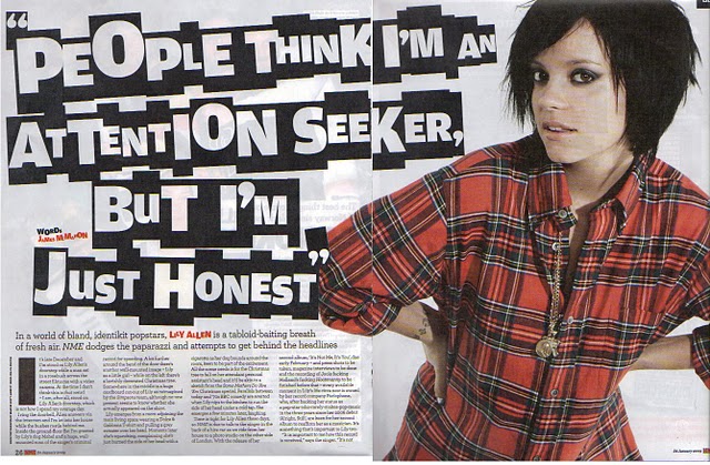
- This main article consists of the well-known artist Lilly Allen. Her picture is very big and placed on one whole page which suggests her superiority in the music industry and in the music she produces.
- She is dressed very simple with limited jewellery linking to the floating quote ‘’ I am just honest’ showing she is not an attention seeker.
- Her make up, casual cloths and short hair goes with the type of music she is producing.
- She is looking at the audience (direct address). Editors might have done this to draw audience’s attention as it looks like she is talking to them.
- Floating quotes are used to draw reader’s attention in the most interesting bits in the interview. The floating quotes are typed in a funny way, this is too catch the audiences eye so that they won’t miss the article out.
- Copy is written in columns, which gives it a constant structure, this suggests that the article is aimed at older target audience between the ages of 18-28. This subverts the R&B genre as most main R&B articles are written in a question and answer form, which makes it easy for audiences to read.
- Subheading is used to give the audiences a taste what the main article is going to be about.
- The colours she is wearing connect with the colour scheme that is used trough out the page. Red is a colour that appeals to both male and a female suggesting the magazine is aimed at a heterosexual audience.
- Further more, a lot of black is used trough out the page which links with hear appearance which is quite gothic and goes well with the type of music she is producing.
No comments:
Post a Comment